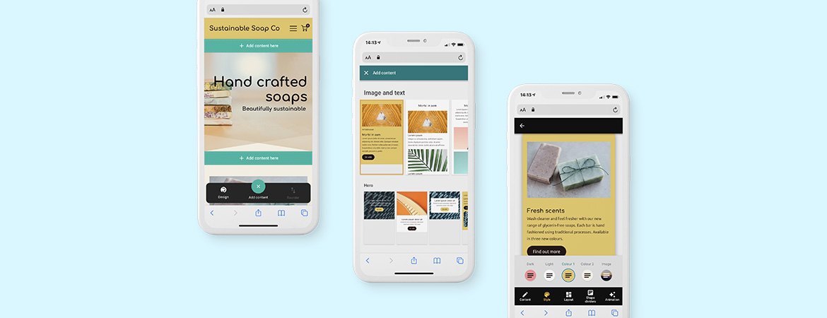
Our Easy Website Builder has everything you need to create your own website and online store in minutes, on any device, regardless of your technical ability or skill level. If you are already using Easy Website Builder you get the gist. You can choose from a wide range of pre-designed sections – each with its own style and layout options – to create a professional website that’s unique to you and your business. What you may not know is that Easy Website Builder is about to get a seriously awesome upgrade that features a new, simplistic way of building. Continue reading to learn more about what’s changing.
Easy Website Builder is getting an upgrade. Here’s what’s changing.
Creating a web presence can seem expensive and extremely technical. The goal of the new upgrade is to make it more like social media in the sense that is it easy to learn, quick to use and always on hand–which is essential for busy people.
Some of the major differences between the old and new versions of Easy Website Builder include content sections instead of templates, the removal of drag and drop tech, and a reimagined toolbar—all improvements that will greatly improve your experience.
The first thing you’ll notice is there are fewer buttons, fewer controls, fewer panels and fewer pages. Instead of choosing from a library of templates and dragging-and-dropping website elements into place, there is a library of of pre-formed ‘sections’ that cover a huge range of content layout possibilities. This removes the need for repetitive drag and drop interactions and makes it easy to get a layout that looks great on every screen.
Probably the biggest thing you’ll notice with the upgrade is:
- A new focus on the mobile experience
- Saying goodbye to drag and drop
- Interactions are completely thumb-friendly
- Design excellence for all screen sizes
Easy Website Builder Feature Improvements
You can still find all of the features you love in the new upgrade, redeveloped in a fresh and inspiring way with your experience in mind. We can’t wait to share these changes with you so without further ado continue reading to learn about all of the improvements you can expect to see when you upgrade.
Widget Panel Improvements
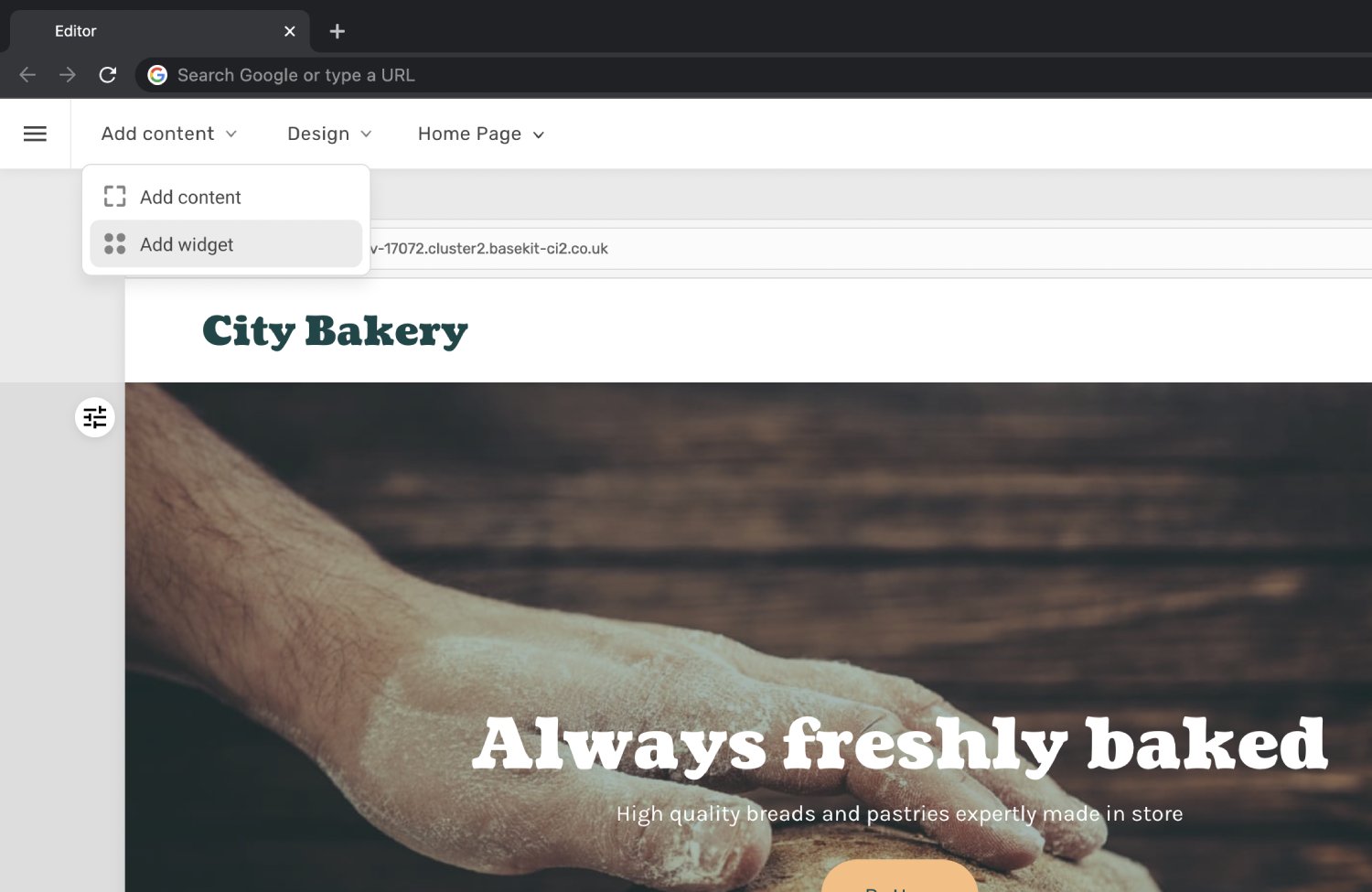
Here’s what’s new:
- New visual design
- The widget panel now opens on the left-hand side of the editor
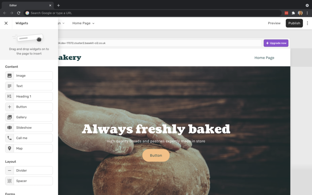
- Widgets are displayed in a single column, making for a better user experience
- Hover over a widget to reveal more information on the functionality of the widget
Toolbar Improvements
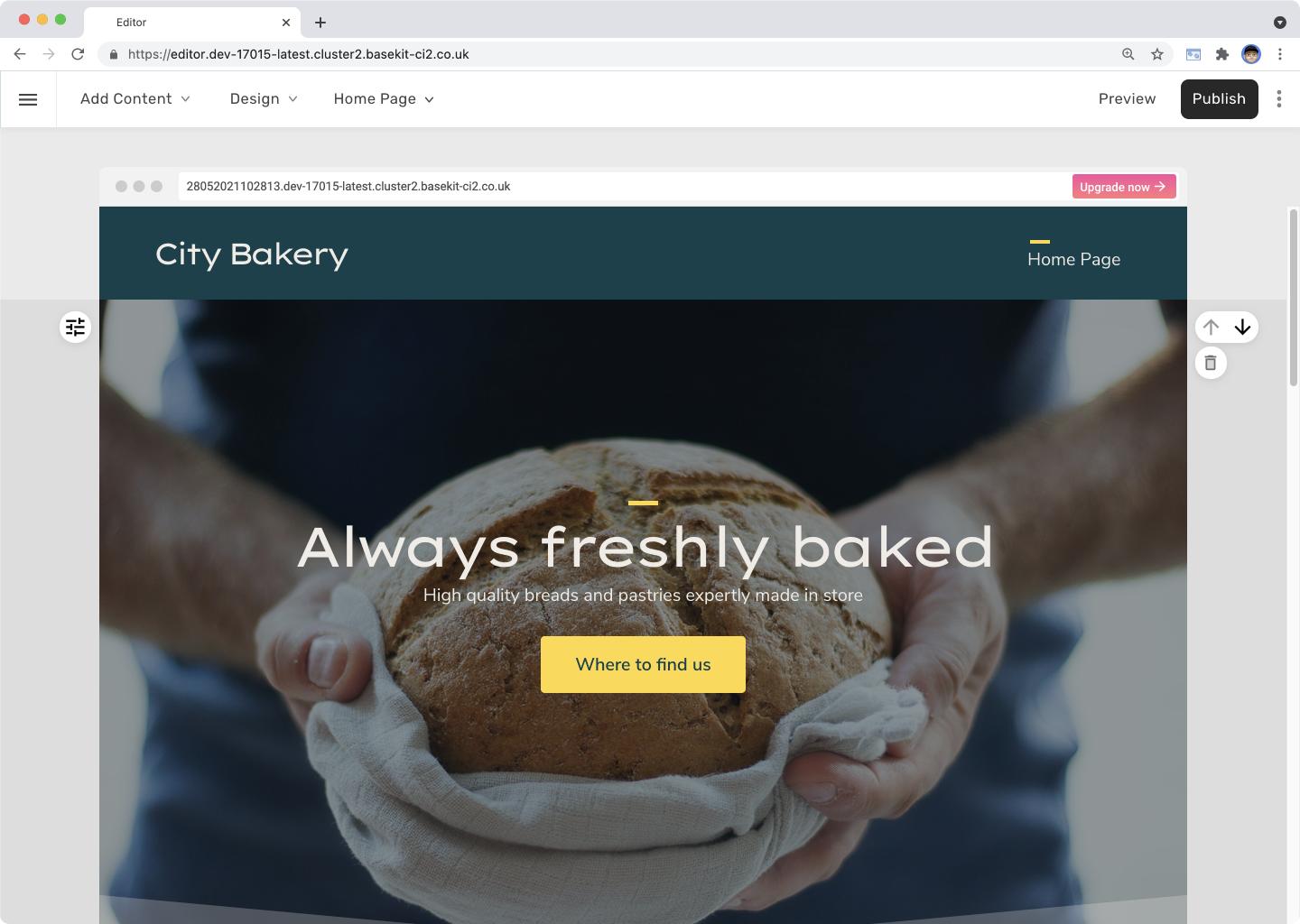
Here’s what’s new:
- Actions previously depicted by icons have been replaced with clearly labeled buttons, making them more accessible at a glance

- New visual design and better usability across desktop and mobile
- Updated visual style—the lighter style removes distractions from the editor so the spotlight is entirely on the website
- Controls for adding content, design mode, and the page switcher have been relocated and grouped within consistent dropdown menus at the top left. This allows for quicker access to the controls that are used most often.
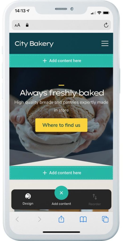
On mobile these actions appear in the new floating actions bar at the bottom of the screen, bringing them all into thumbs reach.
Add Content Improvements
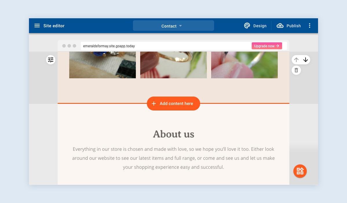
“Here’s what’s new:
- Make it quicker and easier to add content by removing unnecessary clicks from the add section process
- More visible “Add content here” button
- Instead of manually dragging and dropping, users now simply hover over any section and click the “Add content here” button. This will open the section library where users can choose a section type.
Text Editor Improvements
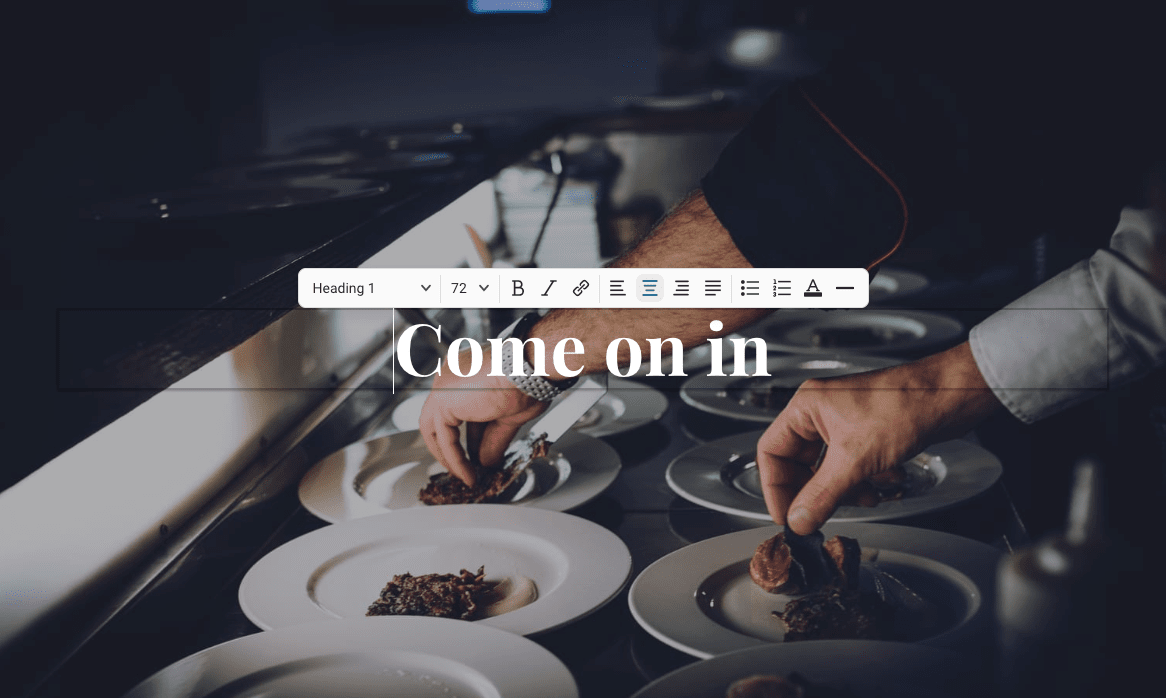
Here’s what’s new:
- More options
- Improved design
- Added inline text size option
- Added divider option
- Improved link management
Slideshow and Gallery Improvements
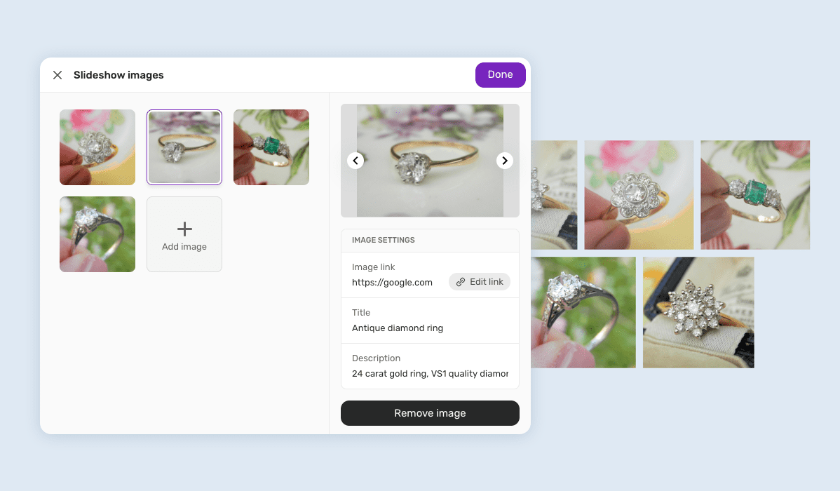
Here’s what’s new:
- Improved the visual design and usability of the gallery and slideshow settings
- New image management panel where you can:
- Quickly add and remove images
- Reorder and add image attributes (title, description, link)
Image Aspect Control
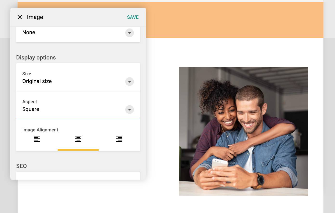
Here’s what’s new:
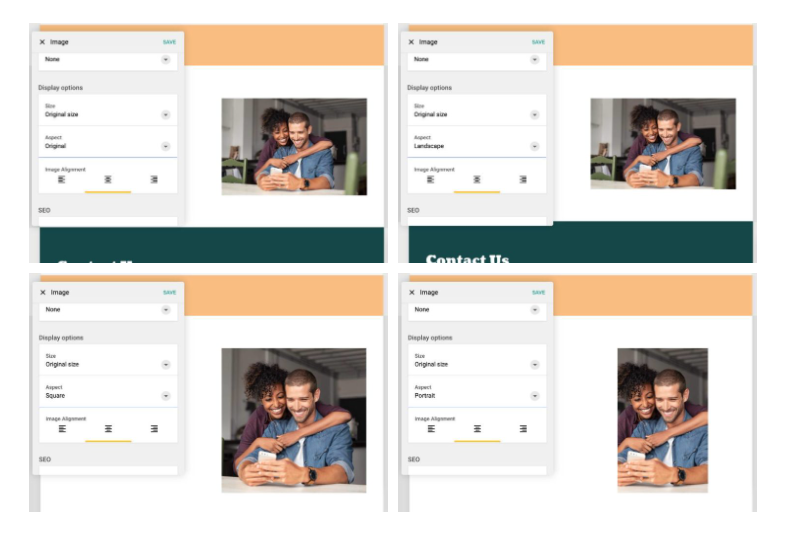
- The Aspect setting gives you more control over how your images are displayed without having to manually edit them
- Edit photos in 3 different aspects: Square, Landscape and Portrait
Height Settings for Sections
“Here’s what’s new:
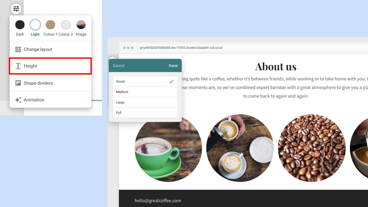
- New height settings feature lets you increase and reduce the height of sections
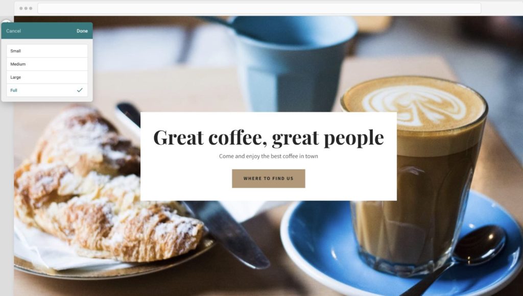
- Hover over a section to find the “Appearance” menu, select “Height”
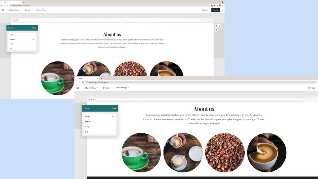
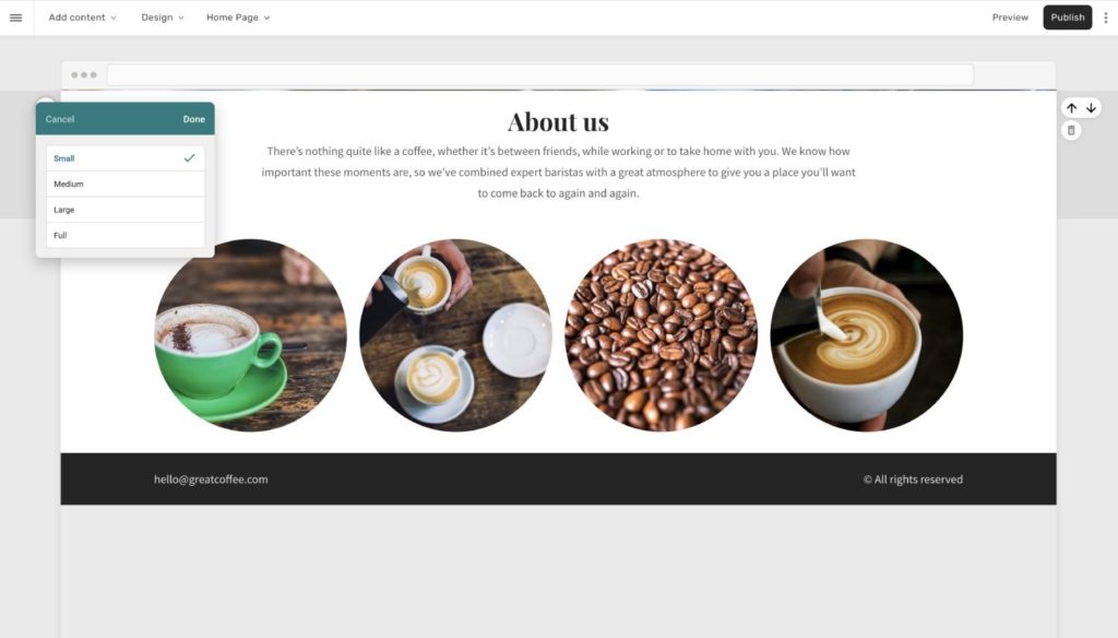
- Choose from the four options: Small, Medium, Large or Full
- Full height sections expand a hero section across the full width and height of the screen
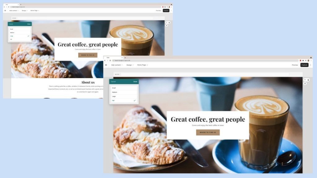
- Small height sections reduce the amount of space between sections
Fixed Sidebar Template
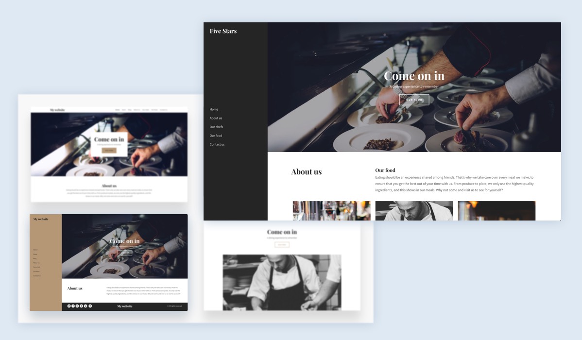
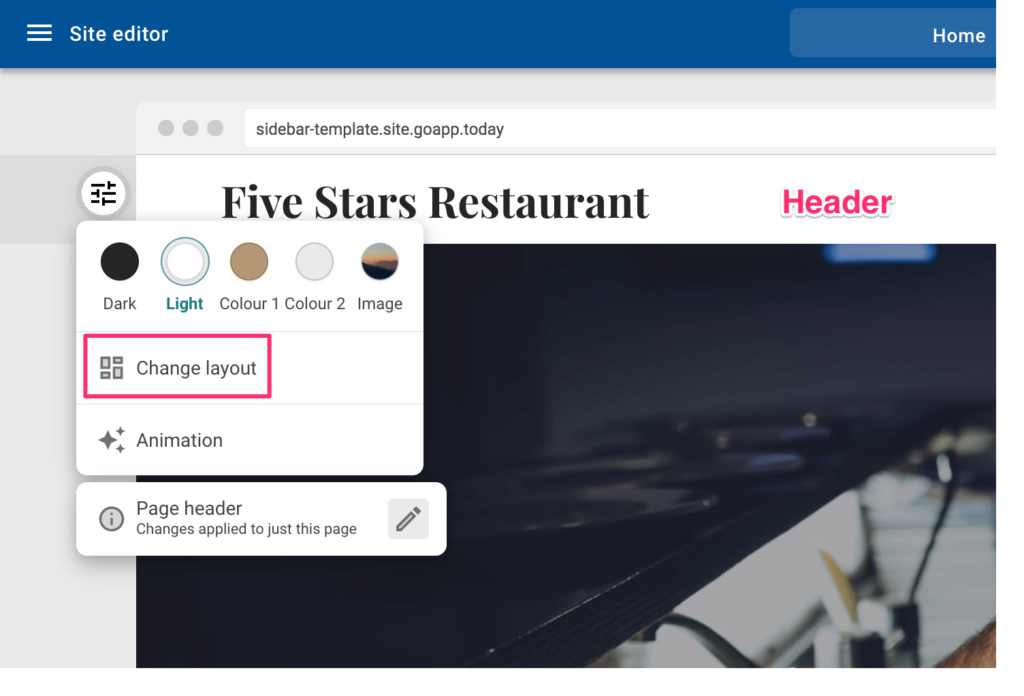
Here’s what’s new:
This layout is available as a template during onboarding, and also as a shared header layout accessible via the “Change layout” menu in Easy Website Builder, as shown below:
There is a new sidebar layout available—which is “fixed” in position as the user scrolls down the page.
Store Order Page Improvements
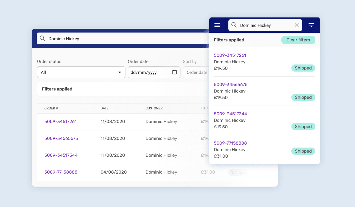
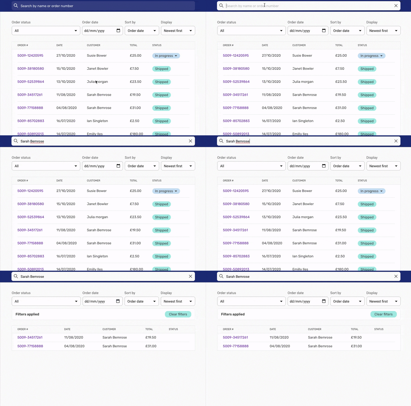
Here’s what’s new:
- New management and display options
- Search by order number or customer name
- Filter by order status and order date
- Display orders by date and age
New Tax Options
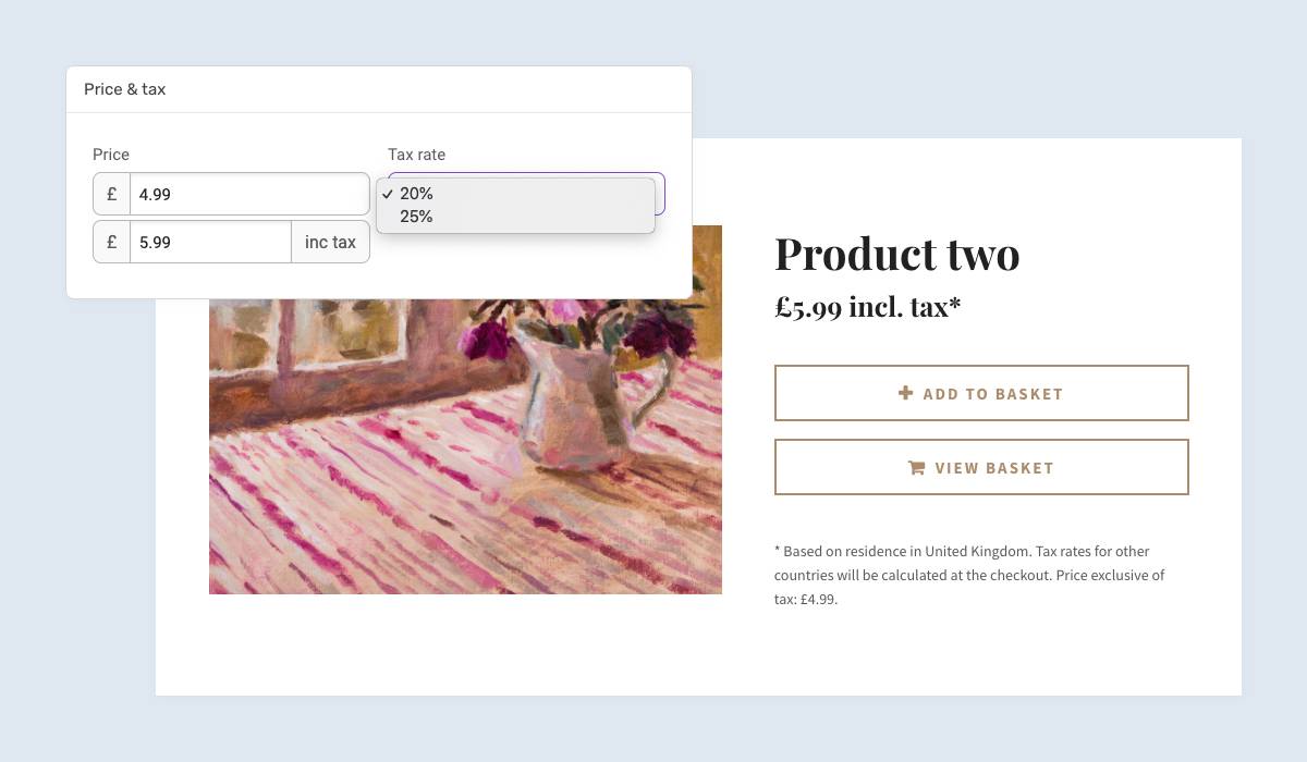
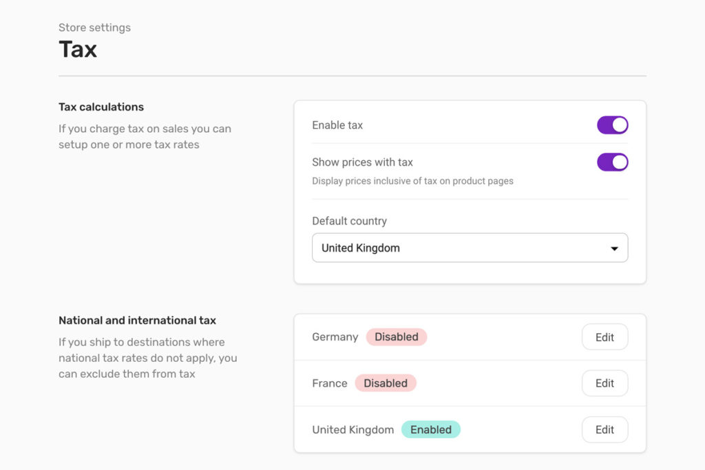
Here’s what’s new:
Easy Website Builder customers can set up multiple tax rates and choose which one to apply to each product. Destination countries where the tax rate does not apply can be excluded.
Final Thoughts: Easy Website Builder Upgrade
We hope you enjoy the upgraded version of Easy Website Builder we believe will greatly improve your experience! As always, we want to hear from you. If you have any questions, please feel free to contact us by means of the usual support channels and share your feedback with us at [email protected].