

Of all the choices you make when designing a website, one of the most important is the colors you use. Without reading anything on a website, simply seeing the colors it uses can tell you a lot about its products and the company behind it. That is, of course, provided the designers chose colors that would deliver the right user experience to the site’s visitors. This article will discuss how to use the color wheel to find color combinations, and introduce you to tools that can help you choose colors for your website’s UX design.
Back to Grade School
When you were at school you learned that the three primary colors were red, blue and yellow. When you mix these primary colors together, you get what are called secondary colors — mix red and yellow to make orange, mix red and blue to make purple and mix blue and yellow to make green.
Mixing the secondary colors gives you tertiary colors which are yellow-orange, yellow-green, red-orange, red-violet, blue-violet and blue-green. The name of each tertiary color is derived from the colors that are mixed to make it, with the primary color first.
Arranged around a circular color wheel you will see that red, yellow and blue appear equal distances around the color wheel. Between them are the secondary colors and between each primary and secondary color is a tertiary color. The colors on the red side of the color wheel are called warm colors and those on the blue side are considered to be cold colors.
There is, however, more to this relationship between colors than simply being able to locate them on the color wheel. By drawing lines and triangles between colors on the color wheel you can assemble colors that look good together, which is our goal.
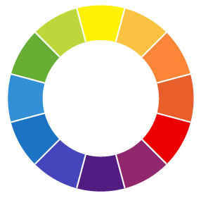
Color Wheel: The color wheel is composed of three primary, three secondary and six tertiary colors.
Color Schemes
Colors that are opposite each other on the color wheel are called complements or complementary colors. For example green and red are complementary colors and, used together they can have a big visual impact — think Christmas.
The Triad color scheme is a color scheme that works on three colors that are equal distance apart on the color wheel. The basic triad is the primary colors of red, blue and green, but you can also have a triad of the secondary colors or of a combination of some tertiary colors. Triad color schemes result in colors that work very well together and they’re also very bright with a lot of contrast between the individual colors.
An analogous color scheme is an almost monochromic color scheme which is created using colors that are very close to each other on the color wheel. Because of their proximity to each other, the colors look very similar and have a very solid feel about them.
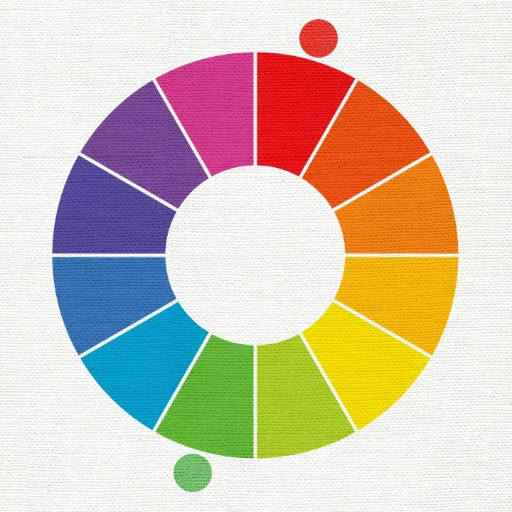
Think Christmas: Complementary colors are opposite each other on the color wheel and they have a big impact. (Image Source: Play Crafts)
In addition to the complementary color scheme, you can have what is called the split complementary color scheme. In this instance, instead of using two colors that are complements of each other such as red and green you use one color and two tertiary colors either side of its complement. For example, you might combine red with yellow-green and blue-green.
Each of these color combinations can be created by simply looking at the color wheel and plotting those colors that are in the desired relationship to each other. To create a complementary color scheme you draw a line across the color wheel from one side to the other and the colors at either end of the line are complements of each other.
Online Tools
To save having to do all the work, there are some online tools you can use to do this more easily. Some websites allow you to select a color on the color wheel and then select a color scheme to test. For example, choose Complement and drag on the color wheel to view complementary colors. These design tools can even show you how your colors might look when applied to a project.
We recommend adjusting the saturation and lightness so you can view different versions of the scheme. Increase the lightness to view a pastel version and reduce the saturation to achieve a more muted and monochromatic version.
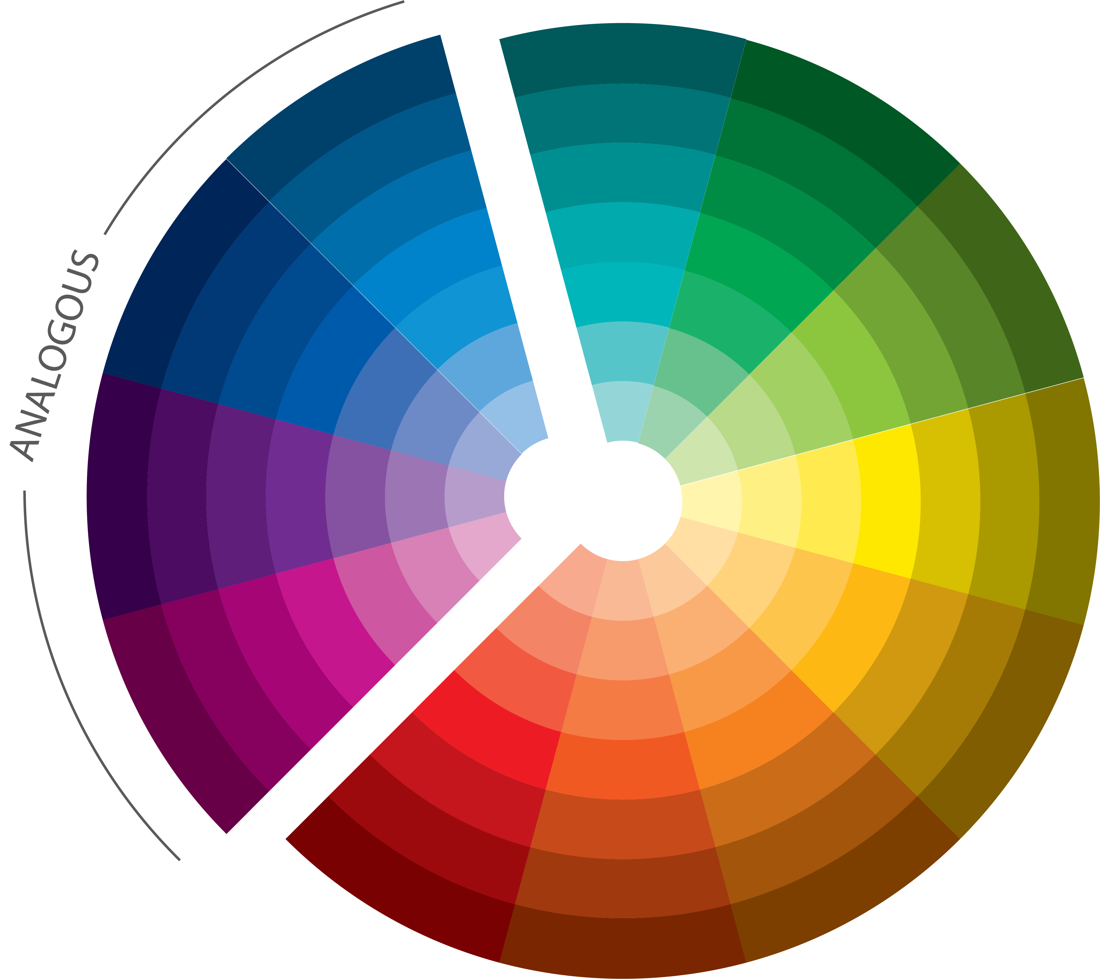
The analogous color scheme is very subdued and the colors are all close to each other. (Image Source: Look Studio)
The Emotion of Color, What’s Hot and What’s Not
One reason why color is so important a choice for a website is that colors are suggestive of emotions and many have a cultural significance. In western society, white is the color of purity and associated with weddings but in other societies it is associated with death and funerals. Knowing what a color means to your visitors can help you choose colors that will carry your desired message to your website’s visitors.
For a site that wants to look serious and professional, a monochromic or analogous color scheme will carry that message, particularly if it is based on a shade of blue. Brighter high contrasting color schemes of lime green and pink are appropriate for kids and pastels are always popular for babies. At any time, there are colors that are very “in” and you might use these if being on the cutting edge is important for your site. The Pantone website tracks the colors that are in fashion each season.
Choosing the right color scheme for your website is a combination of determining what colors will carry your desired message to your site visitors and assembling a small palette of colors designed around this color to be your color scheme.
Resources for the Color Challenged
If you need help, here are some of my favorite color resources:
- Color Explorer: You’ll need a spare hour or so to really take in all this site has to offer. Here you can put the primary and secondary colors through their paces to see what each color suggests in terms of emotions and cultural significance. The site is an absolute delight to view and enjoy. If time is short, select the Menu and then Stars for the nitty-gritty gritty of what the colors are all about.
- Paletton: You can use this site to experiment with monochromatic, contrasting/complementary, triad, tetrad and analogous color schemes. Click a color on the color wheel and the panels will show you alternative color schemes you can use.
- Adobe: This site from Adobe is a good place to find interesting color schemes that other people from the Adobe creative world have already designed. Check out the Adobe explore page if you’re looking for inspiration, this is a handy place to start. Create your perfect palette by choosing a base color and applying our Color Rules. Convert your color themes to Pantone swatches, then download them to use in desktop applications.

Need some inspiration? Check out our most popular domain extensions now: