
The Essential Principles of Product Page Design
Product pages on an ecommerce website are the pages that spotlight products and offer shoppers a “Buy” button. Think of your ecommerce product pages as your site’s “payoff” pages. It all comes down to that moment when a shopper lands on the product page and considers entering his or her credit card number. A well-designed product page is absolutely critical to an online retailer’s business.
Product Page Design: Step One is Simplicity
Because online merchants spend so much money driving shoppers to their product pages, they want to make sure to make a sale from these pages. Consequently, many e-tailers crowd their product pages with a plethora of items – they figure that if one item doesn’t clinch the deal, then the item right next to it will.
But these crowded product pages are counterproductive. Simplicity is key in a product page. Leading Internet usability guru, Jakob Nielsen says, “Simplicity in the sense that it’s about one product, because when you have multiple products that’s when you add complexity, and it just becomes overwhelming.” Focusing each product page on a single product has become the norm among successful online merchants.
Clarity, too, is important. “The main thing should be extremely clear, like ‘what is this product?’ Here’s a picture of it, here’s the price, and here’s the shopping cart.”
But there are exceptions, he notes. All of a single product’s options should be offered on a single page. “There can be variants of a product, let’s say, a shirt comes in multiple colors and sizes — I would view that as one product.” But in the case of two truly different shirts, they are best placed on two different product pages.
In the case of items that are similar yet different — for example, various types of camera with different lenses — links to them should be displayed not on a product page but on a category page. (A category page is one level up from a product page, and it offers links to a broad array of products).
In this case, these similar cameras should be presented on the category page with short descriptions, such as: “Here’s one for the professional photographer, here’s one that’s more point-and-shoot, here’s a more feature-rich camera.” The key point: each link on the category page should link to separate, individual product pages.
Product Page ‘Dimensional Navigation’
Imagine a shopper on your product page who has found almost exactly what she was looking for. However, she wants just one more attribute. If the product had this one last feature, she’d plunk down her cash.
But that hypothetical shopper is stuck. Because, for example, the TV she’s looking at longingly fits all the specs she wants, except for one – but your product page doesn’t show her how to navigate to find a TV that has that one additional feature.
The shopper “is typically lost in that situation; she has to go back up and visit all products,” Nielsen says. “And that’s awfully difficult for people to do.” To solve this problem, Nielsen recommends what he refers to as “dimensional navigation.” This navigation style enables the shopper to move from one product to the other according to highly specific criteria – often just one more thing.
Building a page with dimensional navigation means “product pages should actually be linked together,” according to different dimensions or attributes that make sense to the customer.
In other words, “If you know from market analysis that there are certain criteria that people use to buy, build it into your navigation.”
Product Pages Must Be Information Rich
Product pages should be simple, but they shouldn’t lack ready access to a complete source of information.
“Quite often people need to know some specifics to decide whether they want it or not,” Nielsen says. “And this is one of the reasons people give up on buying, because they’re uncertain about some of its attributes – like, ‘Will it work with what I already have?'”
If you don’t make it clear, “People aren’t going to gamble and order it just in case it might work,” he says.
Providing information, however, should be done with care. While a classic mistake is not giving enough information, “there’s a dual problem of giving too complicated information.” Dumping a load of product specs can create the “deer in the headlights” effect in your shoppers, which doesn’t help sales.
The best strategy for providing information is layering. Layering is when all the information is available, yet it’s one click away — but just one click. “It can’t require another fishing expedition to go and find it – it’s got to be a clear link that says ‘technical specs’ – you click that and then you get it.”
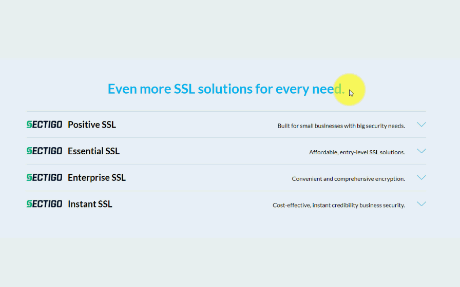
That way, product information is readily available for those who want it, but won’t confuse those who don’t need it. SSL certificates can be a complex product. See how we provided information for advanced users on our product page without having it front-and-center, overwhelming users who aren’t looking for that information.
Offer Expert Opinions on Product Pages
In some cases, presenting an array of expert opinions on the product page can be a seductive sales tool. However, beware: expert reviews must be used cautiously.
“They problem is, can people trust them to be independent reviews, or do they feel like it’s more and more sales information?” Nielsen says.
Shoppers, of course, often visit other sites for research prior to purchase; so placing expert opinions on your product page may be either redundant or actually distracting.
However, if a merchant has a truly accredited source to quote – a well-known publication or product guru – “That’s a big credibility booster,” Nielsen says. “It’s not just you saying it, but there’s actually someone else who’s saying it as well.” This is especially true if you can link to an external site that is clearly independent of yours.
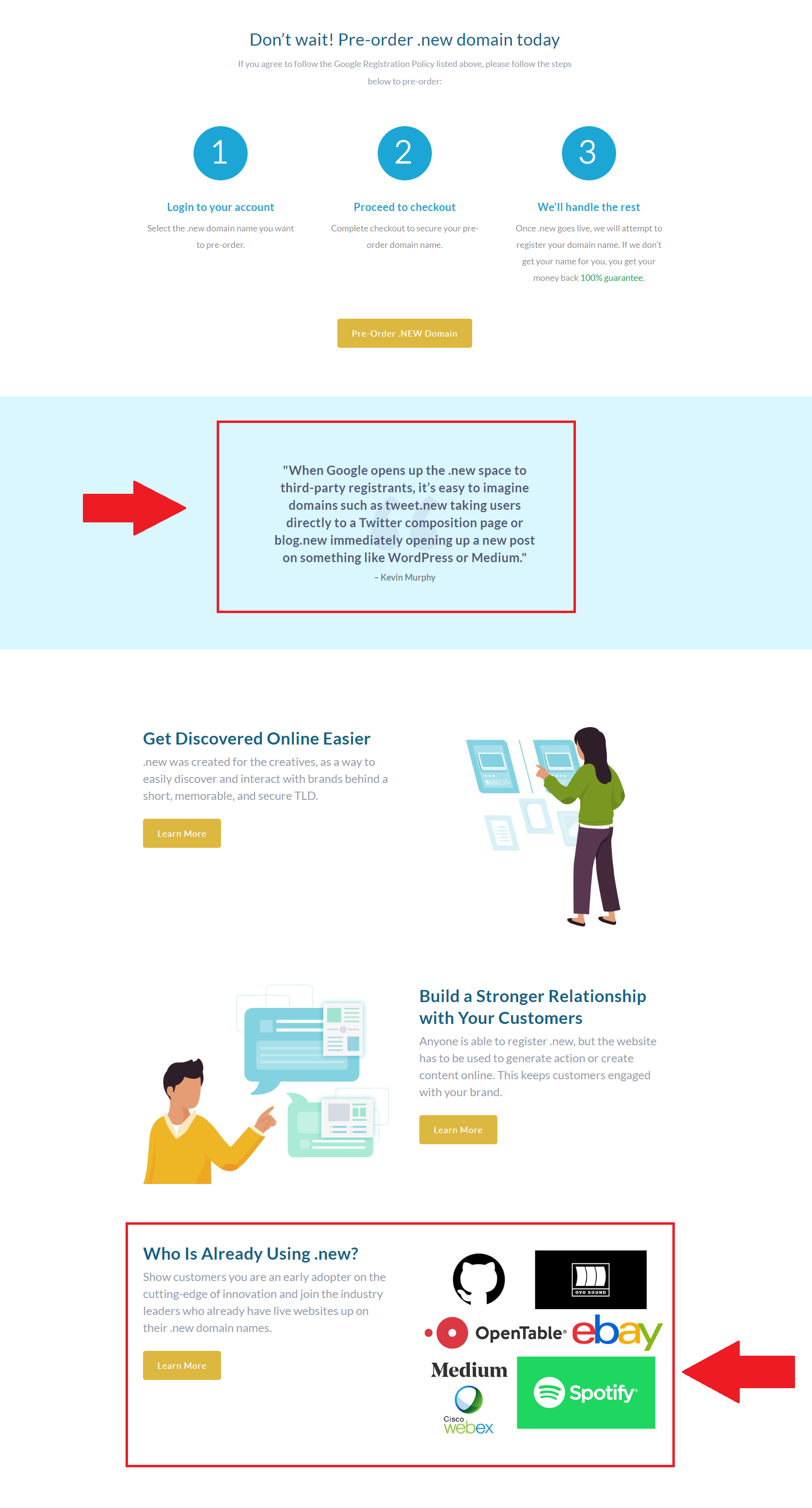
See how we did it on our product page for the .new domain launch. We intorudced a quote from a thought leader in the domain industry, and also featured well-known companies who are already using .new.
Ask ‘Questions’ Before Showing the Cart Page
Many product pages offer shoppers an array of product options; for example, ‘what color do you want that shirt in?’ Or, ‘how finely do you want that coffee ground?’ A product page should ask shoppers to select these options before they put that item in the shopping cart, Nielsen recommends.
The reason: Once that item is in the cart, shoppers may proceed to check out without realizing they haven’t selected all their options. Also, customers often use the “Back” button to exit the cart (instead of “Continue Shopping”), so any selections they’ve made to the item in the cart could be undone.
He also cautions against presenting shoppers with multilevel menus on a product page to select product options. If the user’s mouse strays off the menu at this critical juncture, they could become frustrated.
How to Build the Ideal Product Page
In Nielsen’s view, a well-built product page must include certain key elements:
1. It has a clearly descriptive title and photo
Any search engine optimization (SEO) expert will tell you that a page’s title is how it’s found in search engines, so a descriptive title is a must in a product page’s title and text.
As for the photo, it’s best if a shopper can click to enlarge it, and that this enlarged photo is significantly bigger, not just a little bigger. (And to enlarge the photo, the shopper should be given the choice of clicking the image itself or a “click to enlarge” link.) Ideally, the alternate photos should show different views, allowing the shopper to visually “stroll around” the item.
Nielsen describes the ideal product photo as “big, detailed and free of visual distraction.” (And if that picture doesn’t reveal all the product’s details, accompanying text should fully describe it.)
2. It provides ALL the information a shopper will need
A product page should include not only a detailed list of product attributes (with a nearby link to still more information) but also final cost, including, if feasible, shipping charges and tax. In Nielsen’s consumer research studies, 11 percent of “sales catastrophes” (a failure to make a sale) were due to the product page not providing enough information. Also important: avoid jargon or industry-specific lingo.
3. It states product availability and, when appropriate, delivery time
You’ve ruined a customer relationship when you force a customer to go through check out to discover that the item won’t ship for three weeks. On the other hand, letting them know the item is “in-stock” and “usually ships same day” is an attractive offer. “The bottom line is that the product page should clearly indicate whether an item is in stock, and if it is not, the page should explain the situation,” Nielsen notes. Lack of information about ship date and availability “really lowers willingness to buy.” In our case it is very important that we set expectations clearly of how long it takes to register a domain, because some take longer than others.
4. It links to your site’s guarantee policy, and if possible, manufacturer’s warranty
Many experts have noted that a prominently displayed guarantee policy, with a money-back offer, is a trust builder (and hence a sales builder). In fact, many design gurus say that guarantees should be on every page of a site, not just the product pages.
5. The no-brainer: a prominently displayed ‘Buy’ button
If shoppers can’t get it into the shopping cart – easily – they’re not going to buy it. Remarkably, in Nielsen’s studies of consumer interactions with e-commerce sites, “We’ve had cases where people haven’t been able to find out how to buy, because it’s so complicated.” His study found that six percent of sales catastrophes were created by a user’s difficulty getting the item into the cart.

Need some inspiration? Check out our most popular domain extensions now: